Simple Linear Regression - Part 3
GDP and Life Expectancy
I applied simple linear regression to physical quantities in an engineering problem in part 2 of this series. Here, we will see how simple linear regression performs on a more complicated problem in social science.
Data Cleaning and Exploration
My main objective here is to construct a simple linear regression model that predicts $ Y = $ life expectancy in number of years.
I am using a set of data from https://www.kaggle.com/kumarajarshi/life-expectancy-who. Quoted from that webpage : the data was collected from WHO and United Nations website with the help of Deeksha Russell and Duan Wang.
Before I can proceed, I poked around the dataset to see what it is like, and if there are issues with it. One of the first things I had to fix was the inconsistent usage of whitespace in the dataset’s header.
f = open('Life Expectancy Data.csv','r') # open file
x = f.readlines() # read into x
f.close()

# get rid of excess whitespaces in header
x[0] = x[0].replace(' ,',',')
x[0] = x[0].replace(', ',',')
x[0] = x[0].replace('  ',' ')

g = open('life.csv','w')

for index in range(0,len(x)):
    g.write(x[index])

g.close()
There are more issues with the data, such as missing values. But let’s first load the csv file with Pandas, compute the correlations and take a look.
data = pd.read_csv('life.csv')
life = data['Life expectancy']
corr = data.corr()
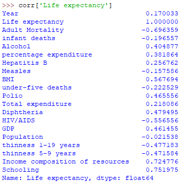
We want our explanatory variable to be “highly” correlated with $ Y $ . A few of the variables meet this rough criteria. For example, schooling has a correlation coefficient of $ 0.751975 $ . However, this might be due to the fact that the longer someone lives, the more years of schooling they can get. “Income composition of resources” is highly correlated as well, but there are too many unknowns with regards to how this number is calculated.
In the end, I went with the classic choice of $ X = $ GDP for the explanatory variable However, there are $ 453 $ rows that are missing GDP values. The life expectancy values of these rows appear to be random, and do not appear to introduce bias when removed. So, these rows are removed. Rows without the necessary $ Y = $ life expectancy values are also removed.
gdp_nan = data['GDP'].isna()
life_nan = data['Life expectancy'].isna()
nan = gdp_nan | life_nan # bitwise OR operator
not_nan = ~nan # bitwise NOT operator

data = data[not_nan]
Fitting The Model
Let’s take a look at the scatterplots of GDP and life expectancy.
plt.rcParams.update({'font.size': 18})
plt.subplot(1,2,1)
plt.scatter(data['GDP'],data['Life expectancy'])
plt.xlabel('GDP')
plt.ylabel('life expectancy')

plt.subplot(1,2,2)
plt.scatter(np.log(data['GDP']),data['Life expectancy'])
plt.xlabel('log GDP')
plt.ylabel('life expectancy')

plt.show()

The scatterplot on the left suggests that these two variables have a logarithmic relationship. The right scatterplot, which is log transformed, looks much better for fitting a simple linear regression model.
So, instead of fitting a regression model with variables and , we are instead fitting the model , where , and is the natural logarithm. Just as with part 2 of this article, it is easy to fit a simple linear regression model with sklearn.
# sort data for residual analysis later
data.sort_values(by=['GDP'],inplace=True)

x = np.log(data['GDP'])
x = x.to_numpy()
x = x.reshape(-1,1)

y = data['Life expectancy']
y = y.to_numpy()
y = y.reshape(-1, 1)

reg = lr()
reg.fit(x, y)

reg.score(x, y)
reg.coef_
reg.intercept_
The coefficient of determination , and the estimated values of and are printed out below as reg.score, reg.coef_ and reg.intercept_ respectively.
>>> reg.score(x,y)
0.35802838694707295

>>> reg.intercept_
array([46.43152011])

>>> reg.coef_
array([[3.07175769]])
Visualizing The Fit
Just like in part 2 of this article, we plot the regression line over the data points to visually gauge how good the fit is. It is probably not a surprise that higher GDP leads to higher life expectancy.
While the regression line looks like a nice approximation to the general trend, there is clear heterogeneity in the variance of the residual errors. Countries with high GDP tend to have less volatile high life expectancy. While countries with lower GDP tend to have life expectancy that is much more volatile.

Residual Analysis
The residual errors are plotted below. Note that $ Y $ has already been sorted from smallest to largest in a previous step.
y_predicted = reg.predict(x)

e = y - y_predicted
t = np.arange(0,len(e))
plt.scatter(t,e)

As expected, the residuals are heterogeneous. Like we mentioned before, residual errors are higher for countries with low GDP, on the left side of the figure. And they are lower for countries with high GDP, on the right side of the figure. This is not a big problem if we are only interested in using the regression line as a rough indication of how the two variables are related.
In this series of articles, I have only looked at simple linear regression, where there is only one single explanatory variable. I went through its mathematical theory and applied it to two real world situations.
I will look at multiple linear regression, in which linear regression is performed with multiple explanatory variables, in another series of articles in the future.