Simple Linear Regression - Part 2
Estimating Yacht Hydrodynamics
Having briefly gone through the mathematical theory in part 1, let’s demonstrate how simple linear regression can be used in practice.
Data Description
The dataset that I will be using comes from https://archive.ics.uci.edu/ml/datasets/yacht+hydrodynamics, and is contributed by Dr Roberto Lopez (Ship Hydromechanics Laboratory, Maritime and Transport Technology Department, Technical University of Delft ). If the link above becomes broken, please Google for “yacht hydrodynamics dataset”.
The link above has a description of the variables in the dataset:
- Longitudinal position of the center of buoyancy.
- Prismatic coefficient.
- Length-displacement ratio
- Beam-draught ratio
- Length-beam ratio
- Froude number
- Residuary resistance per unit weight of displacement
The variable I am trying to predict is $ Y = $ residuary resistance per unit weight of displacement.
Cleaning and CSV Conversion
The data comes in a text file with a .data extension. It is space separated in an inconsistent way, and is also missing headers for each column. Let’s rename the file to “yacht.txt”, add a row of headers, clean up the excess whitespace, and turn it into csv format.
f = open('yacht.txt','r')
x = f.readlines()
f.close()

g = open('yacht.csv','w')
g.write('buoyancy,prismatic,length-displace,beam-draught,length-beam,froude,resist\n') # write header row

for i in range(0,len(x)):
  y = x[i].strip() # remove leading/trailing whitespace
  y = y.replace('  ',' '); # some rows had double spacing
  y = y.replace(' ',','); # replace single spaces with comma
  g.write(y + '\n') # added a line break after each row

g.close()
Preliminary Exploration
Let’s start by looking at the scatter plots of $ Y $ against the rest of the variables.
import pandas as pd
import matplotlib.pyplot as plt

data = pd.read_csv('yacht.csv')

for i in range(0,6):
    plt.subplot(2,3,i+1)
    plt.scatter(data.iloc[:,i], data.iloc[:,6])

plt.show()

While some of these variables look like good candidates for splitting the data set into clusters, only the bottom right plot ( $ Y $ vs Froude number) shows some potential for a simple linear regression model. The relationship shown in the scatterplot is clearly not linear, but we can apply a logarithmic transform to the $ Y $ variable to get a more linear looking scatterplot.
To do so, we transform $ Y $ into $ Z = \log(Y+0.2) $ , where $ \log $ is the natural logarithm. I added an arbitrary $ 0.2 $ because some values of $ Y $ were close to zero, which behaves badly under logarithmic transformation.
Choices made in this transformation process are not rigorous and does create problems mathematically. Here is a research paper on this topic. However, based on the results we will see later, I believe we should be fine here.
import numpy as np

plt.rcParams.update({'font.size': 14})
plt.scatter(data.iloc[:,5], np.log(data.iloc[:,6]+0.2))

plt.xlabel('Froude number')
plt.ylabel('log residuary resistance')
plt.show()

The dots in this plot of $ Z $ against the Froude number appear to lie on a line. This suggests that a simple linear regression model should be a good fit for the data.
Fitting the Model
Next, I fitted the simple linear regression model $ Z = a + bX $ to our data, using Python.
import pandas as pd # data structures module
import numpy as np # n-dimensional array module
from sklearn.linear_model import LinearRegression as lr

data = pd.read_csv('yacht.csv')

x = data.iloc[:,5]
x = x.to_numpy().reshape(-1, 1)

y = np.log(data.iloc[:,6]+0.2)
y = y.to_numpy().reshape(-1, 1)

reg = lr()
reg.fit(x, y)
We can get the intercept $ a $ , the slope coefficient $ b $ , and the coefficient of determination $ R^2 $ .
>>> reg.coef_ # slope coefficient
array([[15.5346844]])

>>> reg.intercept_ # intercept value
array([-3.17263269])

>>> reg.score(x,y) # coefficient of determination
0.9907102525754272
We can plot the regression line over a scatter plot of the data to get a rough idea of how good the fit is.
import matplotlib.pyplot as plt
plt.rcParams.update({'font.size': 18})

plt.scatter(x,y,color='b')
plt.plot(x,reg.predict(x),color='k')

plt.legend(['regression line','original data'])
plt.xlabel('Froude number')
plt.ylabel('log residuary resistance')
plt.show()
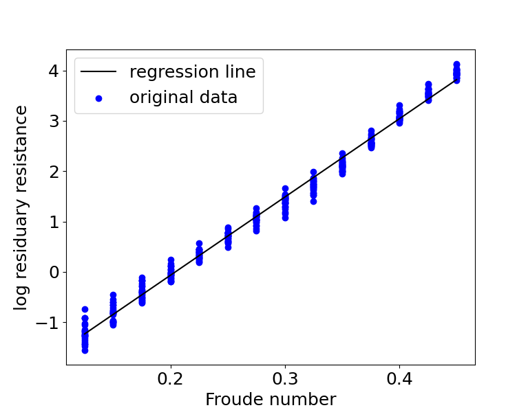
The fit looks amazing! We can recover an equation containing just $ Y $ and $ X $ by substituting $ Z = \log(Y + 0.2) $ into the transformed equation $ Z = a + bX $ . This gives us $ \log(Y + 0.2) = a + bX $ . We can then take exponential on both sides to get
This equation suggests that $ X $ has a multiplicative relationship with $ Y $ , and not an additive one.
Residual Analysis
Let’s also plot the residual errors to see if there are any obvious problems. We will need to sort the data by the x-axis values.
data.sort_values(by=['froude'],inplace=True)
Note that the numpy array $ y $ in the code below is from the sorted dataset.
import matplotlib.pyplot as plt # for visualization
plt.rcParams.update({'font.size': 18})

e = y - reg.predict(x)
t = np.arange(0,len(e))

plt.subplot(1,2,1)
plt.scatter(t,e)
plt.title('residual scatter')

plt.subplot(1,2,2)
plt.hist(e)
plt.title('residual histogram')

The left subplot of the residual errors shows clear heterogeneity. Errors corresponding to values in the middle are skewed downwards. While errors corresponding to values away from the middle are skewed upwards. That being said, our regression line still gave an excellent fit, and should be a fine approximation of the true relationship.
The histogram on the right subplot is roughly symmetric and does not look too skewed. Note that there is no objective quantitative method for doing residual analysis. It is entirely subjective!
I found out later that the Froude number is an important Physics concept for determining resistance. This highlights a particular situation that linear regression excels at: estimating physical laws of nature, similar to how Carl Friedrich Gauss used the method of least squares to estimate celestial orbits.
We will see another application of simple linear regression to a more messy example in part 3 of this article.